Te Pūrākau
The Narrative
Te Pūrākau
The River Journey
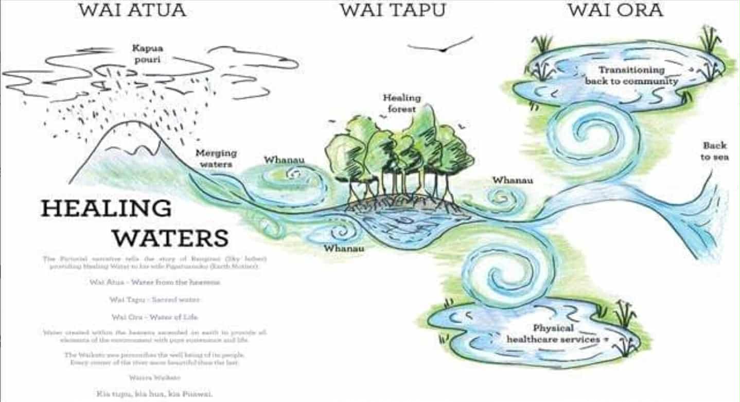
The brand narrative is grounded in the journey of the Waikato River, from its origins as rain falling from the heavens to its meeting with the ocean. This is not a metaphor chosen for marketing convenience. It is a whakapapa narrative developed with Ikimoke Tamaki-Takarei, Pou Tikanga, and it carries the cultural authority of Te Rau Ora and the mana of the Waikato rohe. Every visual, every line of copy, and every piece of conference collateral should feel like it belongs to this river.
Wai Atua (water from the heavens). The rain falls from Ranginui. Kapua pouri, the dark clouds, release their waters. Mauri is derived from two sources: it arrives as rain from Ranginui, or it comes as a spring, breast milk, from Papatūānuku. This is the origin point. In conference terms, it represents the knowledge, research, and lived experience that delegates bring with them to Hopuhopu.
Wai Tapu (sacred water). The rain hits te kahui maunga, the sacred mountains. It collects in the pools of Taupō-nui-a-Tia. The healing forest surrounds the waters. Whānau are present throughout. This is the conference itself: the gathering of people around sacred knowledge, in a protected environment, surrounded by the support of community.
Wai Ora (water of life). The river flows through Kirikiriroa, through Waikato, past the pā and the groves, to the puahatanga, the ocean entrance. Waiora is water in its purest form, used in rituals to purify and sanctify, with the power to give life, sustain wellbeing, and counteract harm. This is the legacy phase. Delegates carry the learning home. The knowledge flows outward through communities, through policy, through practice, into the world.
How to Use the Narrative
The river journey provides a ready-made storytelling arc for all conference communications. Opening ceremonies align with Wai Atua. The conference programme itself is Wai Tapu. Closing and post-conference content aligns with Wai Ora. This is not a rigid framework but a guiding current. When writing copy, designing assets, or planning social content, ask: where does this sit on the river?
Te Au
The Whirlpool
Te Au
Te au means both current and whirlpool. In the context of WISPC, te au represents the moments in life where a person is caught in a dangerous spiral, pulled inward, unable to find their way out without support.
The conference exists to address te au. To build the knowledge, the workforce, and the community connections that help people navigate safely through dangerous waters.
The Visual Motif
The whirlpool motif was designed by Alan Tawhi-Amopiu and is the signature visual element of the WISPC brand. It carries dual meaning: the crisis itself, and the collective response that draws people out of it. When used in conference materials, the whirlpool should evoke both tension and resolution. It is not a decoration. It is a statement about why this conference exists.
Application in Messaging
Te au gives the comms team a powerful framing device. Rather than leading with deficit language or statistics, WISPC communications can reference the whirlpool as a shared experience without graphic detail. "Navigating te au" becomes shorthand for the journey from crisis to healing. This is particularly valuable for social media and delegate-facing content where clinical language can feel alienating and strengths-based messaging creates connection.
Te Waikato
The Waikato as Tupuna
Te Waikato
The Waikato River is not a setting. It is a tupuna, a living ancestor with its own mauri and wairua. This distinction matters for every piece of content the comms team produces. We do not use the river as a backdrop. We do not treat it as scenery. The river is a participant in the conference, and the language we use should reflect that relationship.
Waikato of a hundred taniwha, on every bend a taniwha.
A spring of wellness that comes from deep within the earth, that will never dry up.
Ko Wai Mātou
"Ko wai mātou" means both "we are water" and "who are we." Water is not separate from identity. Our relationship to wai is our relationship to ourselves. This double meaning is a gift for conference communications. It invites delegates to reflect on their own connection to place, to whakapapa, and to the knowledge systems that sustain them.
Place-Based Storytelling
Hopuhopu sits on the banks of the Waikato River. Delegates will see the awa from the conference venue. This creates a rare opportunity for place-based storytelling that most conferences cannot offer. Pre-conference content should introduce the river, its history, and its significance. On-site content should draw the connection between the discussions happening inside and the tupuna flowing past outside. Post-conference content should frame the river as the ongoing current that carries learning forward.
For international delegates who may not know the Waikato, this context is essential. A first-time visitor to Aotearoa needs to understand why the conference is here, not just that it is here. The river answers that question.
Ngā Rauemi
Heritage Assets
Ngā Rauemi
Google Street View: Waikato River
Te Rau Ora assisted Google in mapping the entire 425km length of the Waikato River for Street View, making it the first river in Aotearoa captured this way. The Trekker camera was mounted on waka and jet boats, capturing 360-degree panoramas every 2.5 seconds across the full journey from Taupō to Port Waikato.
This is a significant heritage asset for conference digital storytelling. It can be embedded in the WISPC website, used in pre-conference social content to introduce the river to international delegates, and referenced in presentations. The imagery is cinematic, immersive, and directly tied to the conference narrative.
Mōteatea Māori Video
Te Rau Ora produced a video that blends mōteatea māori with contemporary drone footage and cinematic video production. The piece demonstrates the production standard the conference should aspire to: culturally grounded, visually striking, and emotionally resonant without relying on deficit framing. This video is a benchmark for all WISPC video content and can be used as a reference when briefing videographers, editors, and content producers.
Te Waitohu
Visual Identity
Te Waitohu
Wordmark
Bold, weighted sans-serif with intentional letter spacing. The final "C" carries additional tracking (~120%) to aid pronunciation: WISP C, not WISPC as a block. This deliberate spacing is a subtle but important brand decision. WISPC is an acronym that most people will encounter for the first time. The tracking helps the reader slow down, separate the letters, and read it correctly. It signals care and intentionality from the first glance.
Lockups
Three lockup formats are available to cover the full range of applications, from large-format stage backdrops to small social media avatars. Consistency across these formats is critical. An international audience will encounter WISPC branding across websites, social platforms, email, print, and physical signage. The lockups should be immediately recognisable regardless of scale.
| Lockup | Usage | Minimum Size |
|---|---|---|
| Primary: WISPC 2026 / Waiora Waikato (stacked) | Hero moments, covers, stage backdrops, programme cover | 200px wide |
| Secondary: WISPC wordmark (horizontal) | Headers, email signatures, document footers, name badges | 120px wide |
| Tertiary: WISPC 2026 with date bar | Social media tiles, web banners, sponsor materials | 80px wide |
Logo Hierarchy
When multiple logos appear together (stage backdrop, sponsor wall, printed programme), the hierarchy below must be followed. This is particularly important for sponsor-facing materials where brand placement is contractual.
| # | Element | Notes |
|---|---|---|
| 1 | WISPC 2026 wordmark (primary, largest) | Always dominant. Never smaller than partner logos. |
| 2 | "Waiora Waikato, Healing Waters" | Paired with wordmark. Never used alone. |
| 3 | Te Rau Ora logo | Host organisation. Teal lineage maintained. |
| 4 | WISPC IC logo | Co-governance position. Equal visual weight to TRO. |
| 5 | Sponsor/partner logos (per tier) | Sized according to sponsorship tier. See Pūtea Waiora. |
Ngā Tae
Colour System
Ngā Tae
Primary
Supporting
The Gradient
Bottom-left (deep) to top-right (light). Represents the journey from darkness to healing. Never reversed.
Colour Usage Rules
Deep Teal is the anchor. It carries the most visual weight and should dominate hero sections, headers, and navigation. Mid Teal works for secondary elements, interactive states, and supporting headings. Light and Pale Teal are accent colours for backgrounds, highlights, and data visualisation. Use Charcoal for body text. Use Warm White for page backgrounds and print stock.
The teal palette is inherited directly from the Te Rau Ora brand. This is intentional. WISPC is hosted by Te Rau Ora and the colour lineage should feel like a natural extension of the parent brand, not a departure. Sponsors and partners may notice this connection, and it reinforces Te Rau Ora ownership of the conference.
For accessibility, always test colour combinations for WCAG AA contrast ratios. Deep Teal on Warm White passes. Light Teal on white does not, so never use it for body text or small type.
Ngā Momo Tuhi
Typography
Ngā Momo Tuhi
Typography is the most visible consistency signal across all conference materials. A delegate should see the same type treatment on the website, the programme, the name badge, the stage screen, and social media. Outfit (Google Fonts) is the body typeface. It is open source, widely available, and supports the full range of weights needed for a professional conference identity.
| Level | Weight | Digital | Use | |
|---|---|---|---|---|
| H1 | Bold | 36–48pt | 32–40px | Hero headings, stage titles |
| H2 | Bold | 24–30pt | 24–28px | Section heads, session titles |
| H3 | Medium | 18–22pt | 18–22px | Subsections, speaker names |
| Body | Regular | 10–12pt | 16px | Paragraphs, descriptions |
| Caption | Light | 8–9pt | 12–14px | Credits, photo captions, footnotes |
Te Reo Māori Typography Rules
All macrons must be correctly rendered across every platform. This is non-negotiable. Use the Māori keyboard or character map to insert macrons. Never substitute an umlaut, accent, or plain vowel. Te reo Māori text is never italicised, as italicisation implies foreignness. Dual language headings use te reo Māori first, English second.
When typesetting whakataukī, use the quote block style. Attribution follows on a new line in caption weight. Whakataukī should not be truncated or paraphrased.
Te Tauira
Pattern System
Te Tauira
The whirlpool (te au) is the signature visual element. Designed by Alan Tawhi-Amopiu, it is the only pattern element in the WISPC visual system. This deliberate constraint is a design decision: one motif, used with discipline, creates stronger brand recognition than a library of interchangeable patterns.
Application
Use the whirlpool at 10–20% opacity as a background texture on slides, print covers, and digital banners. At full opacity, it works as a corner accent or section divider. On covers and hero moments, it can be used full bleed. The motif works at any scale, from a subtle watermark on a name badge to a large-format stage backdrop.
Restrictions
Patterns must never be used as generic decoration. They are not interchangeable with other design elements. The whirlpool must never be combined with stock Māori patterns, koru clip art, or other cultural motifs sourced from image libraries. It must never be recoloured outside the approved palette, stretched, rotated beyond its intended orientation, or altered without design team approval. Every element carries meaning, and the integrity of Alan's design must be protected.
If a team member or external supplier needs the pattern file, it must be supplied by Alan or the design team with usage instructions. Do not distribute editable source files to sponsors, venue partners, or PCO teams.
Te Whakaahua
Photography
Te Whakaahua
Photography is the single most important asset for conference marketing. It is the first thing a potential delegate sees on social media, the website hero, the email banner, the programme cover. The standard must be cinematic, not stock. Every image should feel like it belongs to this conference and this place.
Subject Hierarchy
Primary: The Waikato River in all its forms. Aerial drone shots of the river bending through landscape. Close-ups of water moving over rocks. Mist rising off the surface at dawn. The river at Hopuhopu, the river at Huka Falls, the river at the puahatanga where it meets the ocean.
Secondary: Te kahui maunga (the sacred mountains), Taupō-nui-a-Tia, ngahere (forest), whirlpool formations in the water. These landscapes connect to the narrative and give the brand visual range without departing from the river theme.
Tertiary: People in landscapes. Delegates in conversation. Speakers on stage. Cultural activities. These should feel candid and unposed. People should be in relation to place, not isolated against a plain background.
Technical Direction
Tone: Morning light is preferred. Golden hour. Aerial and drone footage. Slow motion water. Movement over stillness. Shallow depth of field for portraits. Wide angle for landscapes. Grade towards the teal palette without heavy colour correction.
Format: Capture in RAW and highest available resolution. Conference photography should be delivered in both landscape (16:9 for web and presentations) and square (1:1 for social media) crops. Vertical (9:16) for Stories and TikTok content.
What to Avoid
Generic stock photography. Deficit imagery showing people in distress. Clinical settings, hospitals, or medical environments. Staged group photos where people are lined up facing the camera. Any imagery depicting self-harm, substances, or crisis. Sunsets (overused and clichéd in conference branding). Urban cityscapes that could be anywhere.
Te Reo me te Āhua
Voice and Tone
Te Reo me te Āhua
WISPC speaks with the voice of the awa. Calm, deep, carrying strength from a long journey. The brand voice should feel like a trusted guide, not a corporate announcement. It should carry warmth without being sentimental, authority without being clinical, and cultural confidence without being performative.
We Are
Grounded. Every claim is supported by evidence, practice, or lived experience. We do not make sweeping statements about "changing the world." We talk about specific communities, specific practices, specific outcomes.
Purposeful. Every piece of communication serves the conference mission. If content does not build awareness, drive registrations, amplify Indigenous voices, or support delegate wellbeing, it does not belong in the WISPC feed.
Warm. We write like people talking to people. Greetings are genuine. Acknowledgements are specific. We use names. We say thank you.
Direct. We get to the point. Conference communications compete for attention against every other email, post, and notification in a delegate's day. Respect their time.
Culturally confident. Te reo Māori is woven naturally through all communications. It is not translated unless the audience genuinely needs it. It is not performed. It is not a feature. It is the language of the host.
We Are Not
Corporate. No jargon, no "stakeholder alignment," no "leveraging synergies." If a sentence could appear in a corporate annual report, rewrite it.
Clinical. This is not a medical conference. While clinical expertise is present, the language should centre community, whānau, and Indigenous knowledge systems.
Performative. Do not use te reo Māori or cultural references as decoration. If you would not say it in a conversation with Ikimoke or Riki, do not publish it.
Deficit-focused. Centre Indigenous voices. Strengths-based framing. Life-promotion, not death-prevention. "Wise practice" over "best practice." Lead with what communities are doing well, not what is broken.
Te Haumaru
Safety Language
Te Haumaru
The Core Principle
WISPC is a life-promotion conference, not a death-prevention conference. This distinction shapes every piece of content. We do not lead with statistics about suicide rates. We do not use crisis imagery. We do not frame Indigenous communities as "at risk" populations. We centre the knowledge, practices, and community strength that sustain life.
Language Rules
Never use: Graphic method descriptions. The word "commit" (use "died by suicide"). Statistics without context or source. Sensationalised framing. Headlines designed to shock. Before/after narratives that detail a crisis journey. The phrase "suicide epidemic" or "crisis" without strengths-based framing alongside it.
Always include: Life-promotion framing. Strengths-based language. Support information (Huarahi Ora 0800 437 009) alongside any mention of suicide. Content warnings where applicable. Te reo Māori as a protective factor, not as decoration.
Practical Application
Every social media post that references the conference theme, speaker topics, or programme content must be reviewed against these guidelines before publishing. This applies to all team members, not just the content creator. If in doubt, escalate to Josh. If the content directly references suicide, lived experience, or bereavement, it must go through the Tier 3 safety review process with Matthew Kiore.
For international delegates posting about the conference, consider providing a social media toolkit with pre-approved language and hashtags. This reduces the risk of well-intentioned but unsafe messaging being amplified through delegate networks.
Naming
Conventions
Naming
Consistent naming across all platforms and materials is essential for an international conference. Delegates, sponsors, media, and partners will all reference the conference differently. These conventions ensure a unified identity.
| Format | Example | When to Use |
|---|---|---|
| Full | World Indigenous Suicide Prevention Conference 2026 | First mention in formal documents, media releases, contracts |
| Short | WISPC 2026 | Subsequent mentions, social media, email subject lines |
| Theme | Waiora Waikato, Healing Waters | Always paired with the conference name, never standalone |
| Hashtags | #WISPC26 #WaioraWaikato #TeRauOra #HealingWaters | Social media. Use #WISPC26 as primary, others as supporting |
Common Mistakes
Never use: WISPC'26 (no apostrophe on acronyms). WISPC26 (always include a space before the year). "The suicide conference" (reductive and harmful). "WISPC conference" (redundant, the C already stands for Conference). Waiora Waikato as a standalone name without the WISPC identifier.
WISPC and WICC
WISPC is not WICC. The World Indigenous Cancer Conference (WICC) is a separate Te Rau Ora conference. Some team members, sponsors, and sector contacts may conflate the two. Be deliberate about using the full name in early communications to establish the distinction. Never use WICC branding, templates, or assets for WISPC materials.
Ngā Hononga
Brand Relationships
Ngā Hononga
WISPC exists within an ecosystem of organisations, each with their own brand, mandate, and audience. Managing these relationships carefully is critical to maintaining brand clarity, avoiding confusion for delegates, and meeting contractual obligations with sponsors and partners.
| Entity | Role | Brand Implications |
|---|---|---|
| Te Rau Ora | Host organisation | Teal palette lineage from TRO logo. WISPC brand should feel like an extension of TRO, not a separate identity. TRO logo appears on all materials. |
| Centre of Māori Suicide Prevention | Clinical and cultural authority | Pearl logo used on clinical and research materials. Not required on general marketing or social content. |
| Huarahi Ora | Bereavement coordination service | Mandatory on all public-facing materials. Name and number (0800 437 009) must be visible. Non-negotiable. |
| WISPC International Council | International governance body | Co-governance logo position alongside Te Rau Ora. Equal visual weight in formal materials. Approval required for governance-level communications. |
| Arinex (PCO) | Professional conference organiser | Handles registration, abstracts, logistics, and delegate comms. Arinex branding appears on operational materials only (registration confirmations, logistics emails). Not on marketing or brand materials. |
Sponsor Brand Management
Sponsor logos are placed according to their tier (see Pūtea Waiora). Sponsors do not receive permission to use the WISPC logo on their own materials without prior approval from Josh. Co-branded content (sponsor + WISPC) must follow the WISPC style guide, not the sponsor's brand. If a sponsor requests a bespoke branded asset, route it through Alan for production to maintain visual consistency.
Pūtea Waiora
Sponsorship Tiers
Pūtea Waiora
Each sponsorship tier is named after a form of water, maintaining the conference narrative throughout the partnership experience. This is deliberate. When sponsors see their tier name in the programme, on the website, or on the stage backdrop, they are participating in the Waiora Waikato story, not just buying logo placement.
| Tier | NZD incl GST | Meaning |
|---|---|---|
| Waiora | $15,000 | Water of life, highest level of wellbeing |
| Waimimiha | $10,000 | Sparkling water, admired and celebrated |
| Waimārie | $7,000 | Calm water, good fortune |
| Waipuke | $7,000 | Flood water, abundance and generosity |
| Waiwhakika | $7,000 | Mineral water, grounding and sustenance |
| Showcase Exhibitor | $4,500 | Exhibition space with delegate foot traffic |
| Showcase (NFP) | $2,500 | Reduced rate for not-for-profit organisations |
Sponsor Deliverables
Sponsor entitlements (logo placement, speaking opportunities, exhibition space, delegate list access) are detailed in the sponsorship prospectus. From a brand perspective, the key rule is that sponsor visibility scales with tier. Waiora sponsors appear largest on the stage backdrop and first in the programme. Showcase exhibitors receive space but not logo placement on marketing materials.
All sponsor logos must be supplied in high-resolution PNG or SVG format. Logos will be placed on a white or warm white background. If a sponsor logo clashes with the teal palette, Alan will produce a monotone version for use in WISPC-branded contexts.
Te Maramataka
Dual Calendar System
Te Maramataka
All materials use dual dating: te reo Māori first, English second. This is a brand rule, not a nice-to-have. On every date reference, in every email, social post, programme, and slide, the te reo Māori month appears first. This signals to delegates, and particularly to international visitors, that te ao Māori is the primary frame of reference for this conference.
The Māori calendar (Te Tau Toru Nui o Matariki) is a lunar system where the position of the sun marks the season, the predawn rising of stars marks the month, and the changing lunar phases mark the day. The year begins with the rising of Matariki (Pleiades) around Pipiri (June), not in January. The table below shows each month, its marker star, and the approximate Gregorian equivalent.
| Marama | Whetū (Marker Star) | Gregorian |
|---|---|---|
| Pipiri | Pipiri (Sheratan), Aries | June |
| Hōngongoi | Takurua (Sirius), Canis Major | July |
| Hereturikōkā | Here o Pipiri (Zeta Persei), Perseus | August |
| Mahuru | Mahuru (Alphard), Hydra | September |
| Whiringa-ā-nuku | Kōpū (Venus, morning star) | October |
| Whiringa-ā-rangi | Whitiānaunau (Algieba), Leo | November |
| Hakihea | Hakihea (Menkent), Centaurus | December |
| Kohitātea | Rehua (Antares), Scorpio | January |
| Huitanguru | Rūhī (Alniyat), Scorpio | February |
| Poutūterangi | Poutūterangi (Altair), Aquila | March |
| Paengawhāwhā | Paengawhāwhā (Enif), Pegasus | April |
| Haratua | Haratua (Matar), Pegasus | May |
Source: Professor Rangi Matamua, Living by the Stars. The Māori year begins with the rising of Matariki (Pleiades) around Pipiri. A 13th month (Ruhanui) is inserted every three years to reconcile the lunar and solar cycles.
Expert Input
Spaces Awaiting Review
Expert Input
Several sections of the brand guidelines require expert review before they can be finalised or used externally. This tracker ensures accountability and visibility across the team. No section marked "Awaiting" should be treated as approved for external use. Content from these sections may be used internally for planning purposes, but must not appear in public-facing materials, media releases, or sponsor communications until sign-off is received.
| Section | Expert | Status |
|---|---|---|
| Clinical Advisory (8.2) | Matthew Kiore | Awaiting |
| Trigger Language (8.4) | Matthew Kiore / Huarahi Ora | Awaiting |
| Social Media Safety (8.5) | Matthew Kiore + Josh | Awaiting |
| Narrative Sketch (1.6) | Ikimoke Tamaki-Takarei | Received |
| Visual Identity (2.1–2.4) | Alan Tawhi-Amopiu | .eps received |
| Display Font (4.1) | Alan Tawhi-Amopiu | Pending |
| Sponsorship Prospectus | Josh + Adrienne Coats | Awaiting |